Cleowi curated discovery
The Pink Edit: A Soft-to-Bold Color Story
Learn how to style blush, mauve, rose and fuchsia with neutrals, texture and contrast across fashion, beauty, accessories and home details.
Pink is easier to wear when you stop treating it as one color.
Blush, shell, rose, mauve, bubblegum, raspberry and fuchsia can sit in completely different parts of a wardrobe. Some behave almost like neutrals. Others take over the room before you have decided what shoes to wear.
That range is the reason pink keeps returning. In 2026, fashion editors have been especially interested in blush and mauve because they can move between soft and structured styling without reading as novelty color. But the useful part is not whether a shade is “in.” It is knowing what job you want the pink to do.
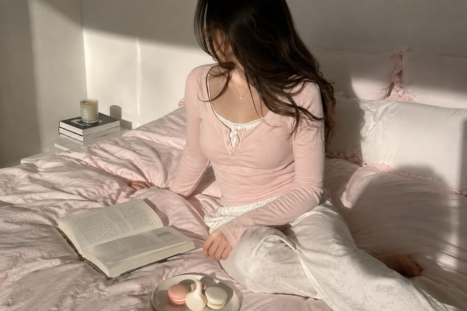
Blush can take the place of beige
Very pale pink is easiest when you treat it as a quiet base rather than a statement.
Try blush with cream, washed denim, charcoal, chocolate brown or black. The darker color keeps the outfit from becoming too sugary; the pink softens the contrast. A blush shirt under a dark jacket, pale pink denim with a gray knit, or a soft pink sneaker with an otherwise neutral outfit can feel surprisingly unfussy.
Texture matters here. Blush in crisp cotton reads differently from blush satin, fuzzy knitwear or translucent glass. If the color is subtle, the material can carry the interest.
Dusty rose and mauve like deeper neutrals
Rose shades with gray, brown or purple underneath feel less sweet and more grounded.
Chocolate, espresso, charcoal, burgundy and deep denim all sit comfortably beside them. This is the part of the pink spectrum that works particularly well with suede-like textures, soft tailoring and brushed knits because the color already has some visual depth.
Mauve can also bridge warm and cool pieces in the same look. It does not have to match anything perfectly. In fact, a slightly off relationship between pink and brown or pink and burgundy often looks more sophisticated than an exact monochrome set.
Bright pink needs less company
Fuchsia, hot pink and saturated raspberry do not need much help.
Choose one obvious focal point and make the rest of the outfit quieter. A bright bag with denim and white. A pink dress with a dark shoe. A vivid lip with otherwise soft makeup. The question is not “what else can I add?” but “what can I remove so this color has room?”
If you want to repeat the pink, do it at a much smaller scale: a nail color, a stripe, a stone in an earring. Repetition connects the look without turning it into a costume.
The same principle works in interiors. One saturated pink object in a mostly neutral room can feel deliberate. Five competing pinks need a stronger reason.
Contrast decides whether pink feels sweet or sharp
A bow, floral print or rounded shoe pushes pink toward romance. A tailored jacket, dark denim, silver hardware or a clean rectangular bag pulls it in another direction.
That contrast is useful if you like pink but do not want the entire outfit to read as overtly feminine. Pair the color with something that carries the opposite energy.
For softer styling, let the color continue into texture: knitwear, satin, lace, plush home details. For a cleaner direction, keep the fabric smooth and the silhouette simple.
The Pink Edit works across fashion, beauty, accessories and home because color is one of the easiest ways to connect categories without making them identical. A blush phone case does not need to match a rose cardigan. They can simply belong to the same mood.
If you are not sure where to start, ignore the trend name and look at your existing neutrals. Cream and tan usually welcome warmer blushes. Gray, black and cool denim can make blue-based pinks look crisp. Chocolate and burgundy are especially useful when you want pink to feel richer.
Then add one thing with a little unexpected structure: a tailored jacket, an oversized shirt, dark denim, a sharp shoe, silver hardware, a graphic shape.
The opposite works too. If the outfit is already structured, one soft pink detail can keep it from feeling severe.
That is the real range of the color. Pink can be quiet, romantic, strange, polished, playful or blunt. You do not need to pick one identity for it.
Choose the shade first. Decide whether it should whisper or lead. Then let the rest of the look do a different job.